
Select your preferred language
Language changes will apply immediately
Select your preferred language
Language changes will apply immediately
Line Charts and How to Read Them
"Learn what line charts are, how to read them effectively, and use them to analyze trends and patterns with ease."
Wikilix Team
Educational Content Team
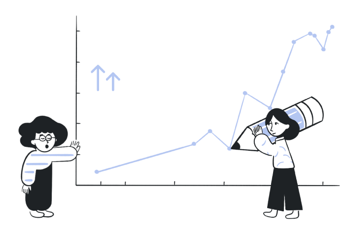
Just imagine looking at a line chart and seeing a story immediately jump off the page through the curves and lines without deciphering cryptic wording or trying to interpret labels. That's the kind of clarity a well-constructed line chart provides when looking at trends and directional changes in data visually.
If you are tracking monthly sales, monthly website traffic, or a point in time for a trending topic, the beauty of a line chart is that you can see patterns, peaks, and turning points with one look! Stay with me, and by the time you are finished reading this article, you will feel like you can not only read these charts—understand the story behind the lines—with the same ease as you can read the time.
A line chart—which is also known as a line graph or plot—depicts values along a two-dimensional plane, with those values connected by a series of straight lines. Usually, time (which can represent days, calendar weeks, months, years, etc.) will fall on the horizontal axis (which we call the x-axis). In contrast, the metric we are interested in (price, count, percentage, etc.) will fall on the vertical axis (which we call the y-axis). As we connect the dots appearing as points over time, we can see how something (a lot or a little) changes over an interval of time in a pronounced way.
Line charts were designed to show trends—whether upward, downward, seasonal, or volatile—and can indicate correlations when multiple lines are employed. Line charts enable us to interpret complex data visually, telling stories with data that facilitate predictions about future observations, facilitate week-to-week category comparisons, and provide a quick evaluation of performance.
Just like anything else, we will start with the basics: what does the title say? What is being shown? What do the axes say? What does each axis represent, and what unit is being used? After you get past the basics, a quick and easy way to determine what the line graph shows is to take a quick look at the shape of the line; is it rising, descending, or flat?
Look for any dramatic shifts, spikes, or dips, which typically point to key events or pivot points. When reading charts, if there are many lines on one chart, read the legends or read the labels to differentiate the lines. If the chart is clean and has a few clear lines, then the user can suspend possible comparisons.
When your data allows for continuous movement along a value or based on a value, such as a time series, use a line chart. Inherently, they are better for showing growth, decline, or cycles. To remove various options from charts, such as plots or charts with areas or bars, the line charts with a line connecting them do not have that option. Line charts, in general, are better at showing a flow or continuation than other options. If there is an overindulgence of lines, a chaotic, messy, or cluttered perception in the overall effects may become more problematic.
One process you can take:
Read the title.
Identify the axes and specify the units.
Look for the trend.
Look for any sharp changes or anomalies.
If there are several lines, look for color/line types and labels.
In general, a step-by-step process enables you to extract the relevant elements with confidence systematically.
A line chart can be used for more than one thing by itself! The primary strength of line charts lies in their ability to represent multiple cases of data recorded historically under the same time properties. Just make sure you can differentiate each line by the color of style, and the whole chart is relatively clean; a steep-looking slope is potentially a sign of a steep, rapid change, while anything less steep may appear to be a stationary moment or something that doesn't seem to be a change.
If you are either designing or reading from a line chart, consider these suggestions:
- Always follow the timeline in a left-to-right process; it helps us all to continue to flow consistently.
- Make sure your ticks and intervals flow in alignment with distortions or others that provide relatively misleading distortions.
- Let missing data be seen - dashed or broken lines will help reduce misleading misinterpretations from false continuities.
- Avoid top/bottom or two axes plots unless you have no other alternative - it usually leaves out comparisons.
- For images or height-width ratios in images, fix the ratio of width-heights to tap into your potential - try to remove the clutter and a sense of excitement!
The components to be aware of:
Title: What's the story you are sharing?
Axes: Are they easy to identify? Do they have identifiable units?
Identify the Legend/Labels: Are there several lines to identify?
Data points/line segments: This is the situation where slope and proximities become more relevant.
Gridlines or light guides: They help us align things.
In the end, understanding the components becomes crucial when thoroughly reading a chart and creating a truly effective one.

Be aware of this kind of stuff:
-Is there anything that has time that's being presented? - Dragon is you collect of get time in intervals appropriately aligned against consumption orientations for the time assessment will have issues locating as logical to be interpreted.
-A graphic that has too many and is with too many lines; part of us- just to be you, just as is, completely lost and lacks the aid of relent - where no aids of any kind are frequently possible with - any limits!
- if you should develop a form of missing data - just don't try to camouflague or hide it; your missing line could end up becoming a significant distraction, an extra-nature for your missing reader-
-Ensure that you do not abuse variable dimensions that have the same identifications, you are the same - no commonality that is a different scaled variables on the x-y axis representations.
So, knowing how to read your name lessons means you shouldn't miss the opportunities to imagine the most benefits for those accessing this line.
In cryptocurrency market analysis, trends and patterns identified through Line Squares can reveal crucial insights into market momentum, volatility, and investor behavior. By observing the degree and modulation of slope changes within structured price coordinates, analysts can detect emerging bullish or bearish tendencies before they become evident in standard indicators. Line Squares help visualize transitions between accumulation, breakout, and correction phases, offering a clearer understanding of the cyclical nature of digital assets.
Over time, the consistency of these geometric trends can signal potential reversals or continuations, making them an effective tool for predicting price movements and optimizing trading strategies in a rapidly evolving market environment.
Line charts are arguably the easiest and most accessible way to think about data visualizations - they are simple in form yet deep in meaning. If you understand the importance of title reading, axis interpretation, visualizing the line path, and how to avoid common confusing mistakes, you can discover not only the data, but the story behind the data. When analyzing and visualizing data, whether it is for business decisions, exploring data trends or satisfying your own curiosity, a clear line chart can illuminate a path forward.
Continue to practice, stay curious (you're just getting the hang of it) and let each and every visual guide your clarity and confidence each and every time.
Keep building your knowledge with our structured learning path. Each section builds upon the previous one.
This is the first section
You're at the beginning of your journey!
This is the last section
You've completed this course!
15 min
Reading time
Beginner
Difficulty
