
Beginner
Exploring Different Types of Forex Charts
Exploring Different Types of Forex Charts
"Struggling to read forex charts? Discover the most common types of forex charts—line, bar, and candlestick—and learn how each can help you make smarter trading decisions.""
Wikilix Team
Educational Content Team
July 28, 2025
10 min
Reading time
Beginner
Difficulty
#sparkofinsight#Understandingforexcharttypes#forex

If you've ever opened an online trading platform and sat staring at those moving lines, colored bars, or candlestick patterns — perhaps wondering what on earth it is you're looking at — you're not alone! Many new traders are overwhelmed by forex charts at first sight. But here's the great news — when you know what the different chart types are, and how the various charts work, the forex market will start to make a lot more sense! One of the key skills any forex trader can develop is the ability to read a chart confidently! In this article, we will guide you through the main types of forex charts in plain, simple English – so don't panic; we won't be using any technical jargon. Instead, we'll use simple language to take the intimidation out of charts and help you understand them more practically.
Why Are Forex Charts Important?
Forex charts are the visual representation of price action in the currency market. Forex charts help traders look at how a currency pair is moving over time — whether it is minute by minute, hour by hour, or day by day. Without charts, it would be challenging to identify trends, see patterns, and make knowledgeable decisions.
Charts are more than just lines and shapes. They are the market's communication device. Charts inform us where the price has been, where it is going, and how it is acting in real-time. Although day traders use charts to find short-term opportunities and swing traders use charts to hold positions for a few days, it is essential to understand the various types of charts.

The Three Main Types of Forex Charts
There are many types of tools and styles, but most trading platforms typically provide three basic types of charts:
1. Line Chart
2. Bar Chart
3. Candlestick Chart
All three types have their advantages and disadvantages, and your choice may depend on personal style and trading strategy. Let's examine each of the three types.
1. Line Charts – The Most Basic
A line chart is the simplest type of chart you will find. A line chart connects closing prices of a currency pair over a selected period by a straight line.
Why Use a Line Chart?
Line charts provide a clear and simple visual representation of price movement. Line charts eliminate the "noise" and enable traders to focus on the overall trend. If you are someone who gets overwhelmed by too much information, using a line chart can be a good starting point.
If, for example, the EUR/USD closing prices were 1.1000 on Monday, 1.1050 on Tuesday, and 1.1100 on Wednesday, the line chart would connect those closing prices, demonstrating an upward trend.
Shortcomings
Does not show highs and lows within the period.
Only displays closing — no information on opening price, high, or lows.
The line chart, simple as it may be, serves a purpose, providing a quick snapshot of market direction that is particularly advantageous for long-term analysis.
2. The Bar Chart – More Detail
The bar chart (also known as the OHLC chart — Open, High, Low, Close) gives considerably more information than the line chart. Each bar shows the range of prices for a particular time frame.
How to Read
The top of the vertical bar represents the highest price.
The bottom of the vertical bar represents the lowest price.
A small tick on the left of the bar represents the opening price.
A small tick on the right of the bar represents the closing price.
Bar charts provide a more comprehensive picture of what happened within a particular timeframe, including volatility and the range of price swings. This can be extremely useful in fast-moving markets or for exact entries and exits.
Pros
• More informative than line charts.
• Good for spotting volatility and determining trend strength.
Cons
• Can look cluttered, especially when assessing short time frames.
• More difficult to read at a glance than a candlestick chart.
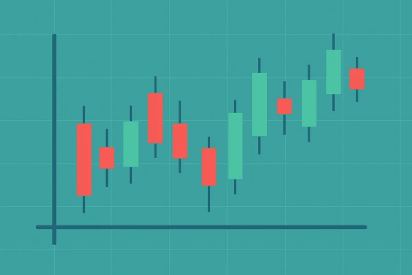
3. Candlestick Charts - Trader's Number 1
Candlestick charts are by far the most common & widely traded chart type in forex trading, and for good reason. They originated in Japan hundreds of years ago, and they provide similar information to bar charts, but they tend to be more visual and intuitive.
Each "candle" represents a set amount of time (1 minute, 1 hour, 1 day, etc.)
Each candle shows:
• Open price
• Close price
• High price
• Low price
How to Read a Candle
• The body of the candle shows the range between the opening and closing price.
• The wicks (the lines above and below the body) mark the high and low of the period.
• If the close is above the open price, it is a green candle (bullish).
• If the close is below the open price, it is a red candle (bearish).
Why do traders love candlestick charts?
• It is easy to read at a glance.
• It has strong visual cues about sentiment in the market.
• It allows for the use of established patterns (Doji, Hammer, Engulfing, etc.)
Candlestick patterns provide useful indications about possible reversals, breakouts, and continuations - so they can be a valuable asset for technical analysis.
Choosing the Right Chart Type For You
There is no one "best" type of chart for every trader. The chart that's best for you hinges on your personality, strategy, and your trading aspirations.
• Newer traders may use line charts in the initial stages of charting and as they begin to learn about trends.
• As they become more experienced, many traders will begin to explore the use of bar charts as they seek more detail.
• More experienced traders will usually prefer candlestick charts, as they provide better visualization and indicate potential patterns.
It's entirely appropriate to employ different charting styles for various purposes. For example, a trader might use line charts to analyze long-term trends and candlestick charts to generate short-term decisions.

How Timeframes Affect the Appearance of Chart Types
One area that often gets overlooked, impacting how chart types appear, is timeframes. A 5-minute chart and a daily chart of the same currency pair can provide significantly different images, even if they are the same type of chart.
Shorter timeframes (minutes, 1, 5, and 15) are typically favored by scalpers and day traders looking to capture a quick move; longer timeframes (4 hours, daily, and weekly) are preferred by swing traders and investors, who look to ride positions for more extended periods.
The type of chart you use should match your trading style and time horizon.
Utilizing Different Chart Types to Analyze
Different chart types are essential to technical analysis, which is the study of price patterns to predict future price action. As outlined in the previous sections, the technical tools of candlestick patterns, trendlines, and support and resistance levels provide traders with loads of information through visualization. If charts are not presented clearly, using technical tools will become difficult. Consider the following:
It is much easier to draw trendlines on candlestick and line charts as opposed to a bar chart.
Price action analysis would be reported in a bar or candlestick chart.
The prettier the price action patterns, the easier it is to identify them (head and shoulders, flags, triangles, etc).
Common Charting Mistakes Hardware Forex Traders Make
Even the most seasoned Forex traders sometimes make mistakes when analyzing charts. To avoid making mistakes, consider the following:
Misusing the charting screen by filling it with symbols or switching chart types too many times.
Not having a whole picture – only looking at one timeframe and missing the whole picture, or thinking too narrowly based on one type of chart.
Seeing a signal everywhere – not all shapes and movements are price action patterns. Be sure you know what you are seeing before acting.
Not adjusting advanced settings – virtually all of the charting platforms allow you to change colors and periods for the chart. Ensure it looks good and is readable to you.
Final Thoughts
Knowing chart types in forex isn't just a skill or a technical aspect of becoming a trader; it's a fundamental part of becoming a confident and competent trader. They are your window into the market. They show you not just what is happening, but how traders are reacting to it, in real-time.
Start simple — become familiar with your chart type(s) and the life of price over time. Identify patterns. Eventually, the abstract mess of lines and bars will start to take shape and become something you can read.
It does not matter what you use to chart — it just matters that you use the chart to make clear and consistent decisions, and that comes from being familiar with your chosen chart type.
Continue Learning
What's Next?
Keep building your knowledge with our structured learning path. Each section builds upon the previous one.
This is the first section
You're at the beginning of your journey!
This is the last section
You've completed this course!